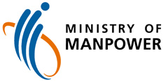
The MOM corporate logo represents our dynamism, energy and confidence, as we work towards achieving our vision of a Great Workforce, in a Great Workplace.

The three blue strokes symbolise:
- Our dynamic approach and commitment to planning, managing and developing Singapore’s workforce.
- Our aspiration to be innovative, flexible and responsive, as we strive to make things better through new solutions and creative ideas.
- Our tripartite partnership where workers, employers and the government must work together as one.
The encapsulating orange swirl represents the importance of partnership beyond tripartite partners, to include those with other government bodies, the private sector and international organisations, to enable the Ministry to operate effectively within the broader global and local contexts.
The fluidity and dynamism of the logo is balanced by the dignity and authority of the typeface. The latter reflects the Ministry’s regulatory role, as we balance the diverse needs of various stakeholders, including employers, foreign and local employees, and employment intermediaries, in pursuit of a globally-competitive one-Singapore workforce and progressive workplaces.